

CVS built a dialysis machine people use at home. It comes with a tablet. That tablet is how a patient and their caregiver run treatment, with no nurse in the room.
The existing training was a paper manual.
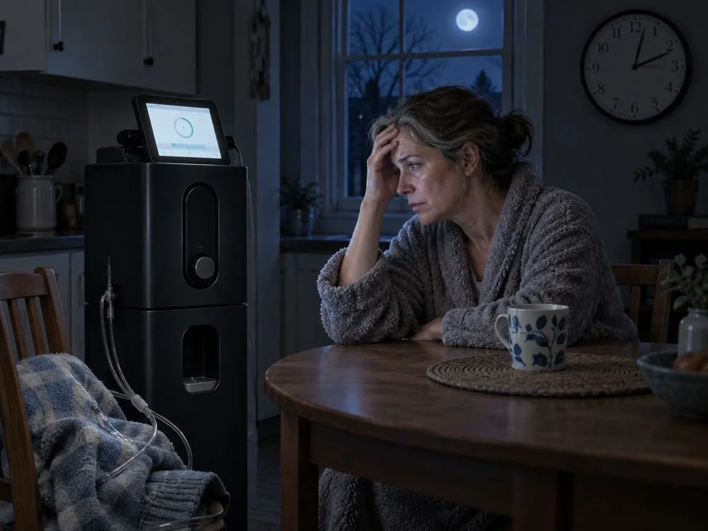
Picture who's using this. Someone frightened, probably tired, maybe in the middle of the night, trying to work out what a medical device is telling them.
I rewrote the brief around how the user feels.
Right brand. Wrong moment.
CVS brand standards are black, red and white. Great for a pharmacy sign. Wrong for someone who's scared.
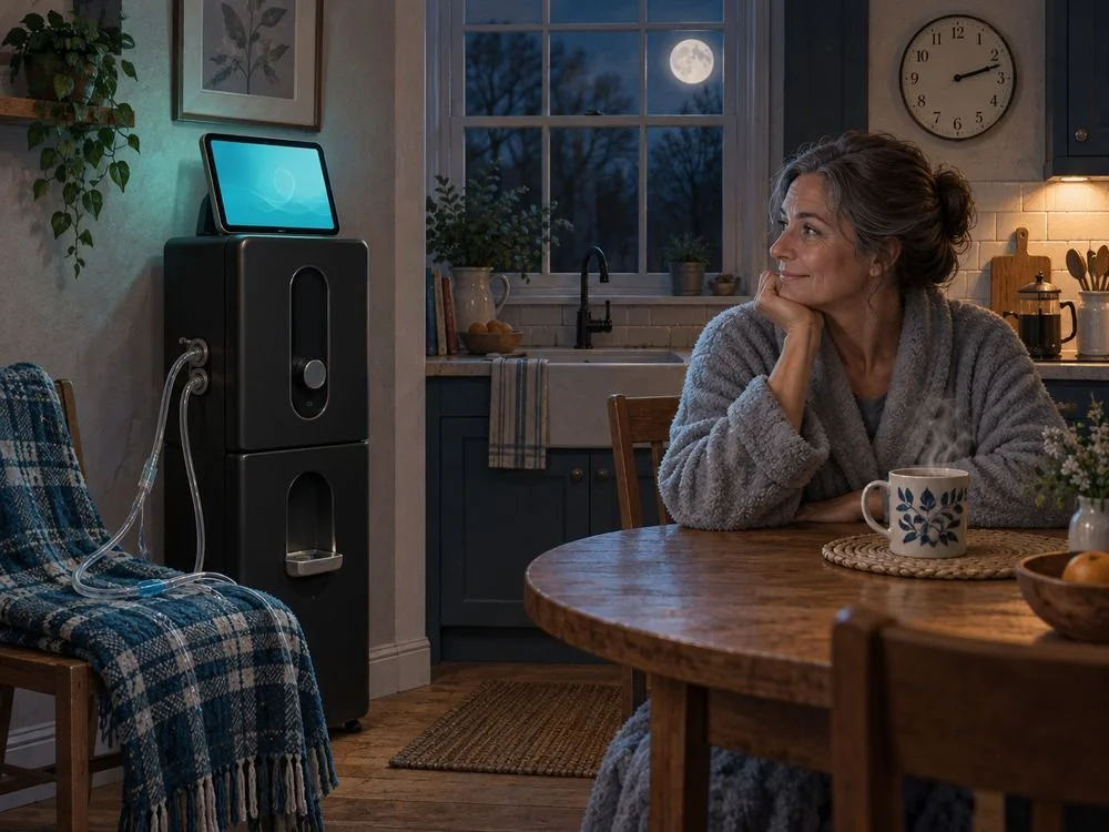
So I adapted the palette. Softer tones, built for a person under stress. Still recognizably CVS.
Illustration of the idea, not the exact palette.
Nobody asked for the psychologists.
I brought clinical psychologists onto the project to shape how guidance was worded and what order it came in.
That wasn't in the scope. It was just obviously what the thing needed.
Two pieces of work, one tablet.
The interface a patient uses to run the device, and the training and education that lives beside it. 150+ screens in all.
Home dialysis is lonely. It's you, your caregiver and a machine. So I designed ways for patients to find each other, and proposed stickers for the machine so people could show how their day was going. Small thing. It's the kind of small thing people remember.
The device shipped and it's in market, ahead of schedule.
It was built to cut setup errors and calls to the support line.
The real brief is almost never the one on paper. I read the situation first, then decide what gets made.
People call this UX or patient experience design. I call it brand, because it decides whether someone trusts you.
What does brand have to do with a medical device?
Everything, once a patient is alone with it. Color, wording and order decide whether a frightened person trusts the screen in front of them. That's brand doing its actual job.
Can a company's brand standards be adapted for a different audience?
Yes, and sometimes they have to be. Here the standards stayed recognizable and the palette changed to suit someone under stress.
Building something people have to trust on first use?
Twenty minutes. No deck.
Book 20 minutes All work