CASE STUDY
Nashville CARES
Reimagining a Legacy of Care for a New Era
Guiding a bold rebrand for Nashville CARES modernizing a 40-year mission to expand healthcare access and equity across Middle Tennessee.
Services: Brand Strategy · Visual Identity · Messaging Framework · Website & Collateral Redesign
Impact: New unified brand system across clinic, mobile units, and outreach programs
Community Served: 50,000+ Tennesseans annually
Goal: Drive awareness, funding, and engagement in an evolving healthcare landscape
THE CHALLENGE
For more than 40 years, Nashville CARES has been the region’s cornerstone of HIV/AIDS support and education.
As healthcare needs evolved, so did CARES—now offering:
Primary medical care and a full-service clinic
Mobile health units reaching rural communities
Behavioral health services and STI testing
PrEP access and holistic sexual health programs
Yet while demand grew, nonprofit funding declined, leaving CARES to do more with less and still reach disproportionately impacted groups BIPOC populations, women, youth, and rural residents.
The existing brand no longer reflected this expanded mission or the diversity of the people it serves.
THE SOLUTION
Key steps included:
Brand Discovery Workshops – Engaged staff, community members, and healthcare partners to define values and vision.
Messaging Framework – Articulated a clear promise of “Comprehensive Care Without Barriers,” centering on trust and accessibility.
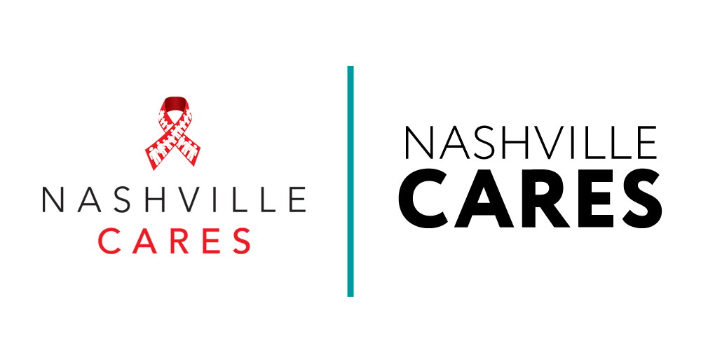
Visual Identity Refresh – A vibrant, modern palette and updated logo system that honors CARES’s legacy while signaling growth and innovation.
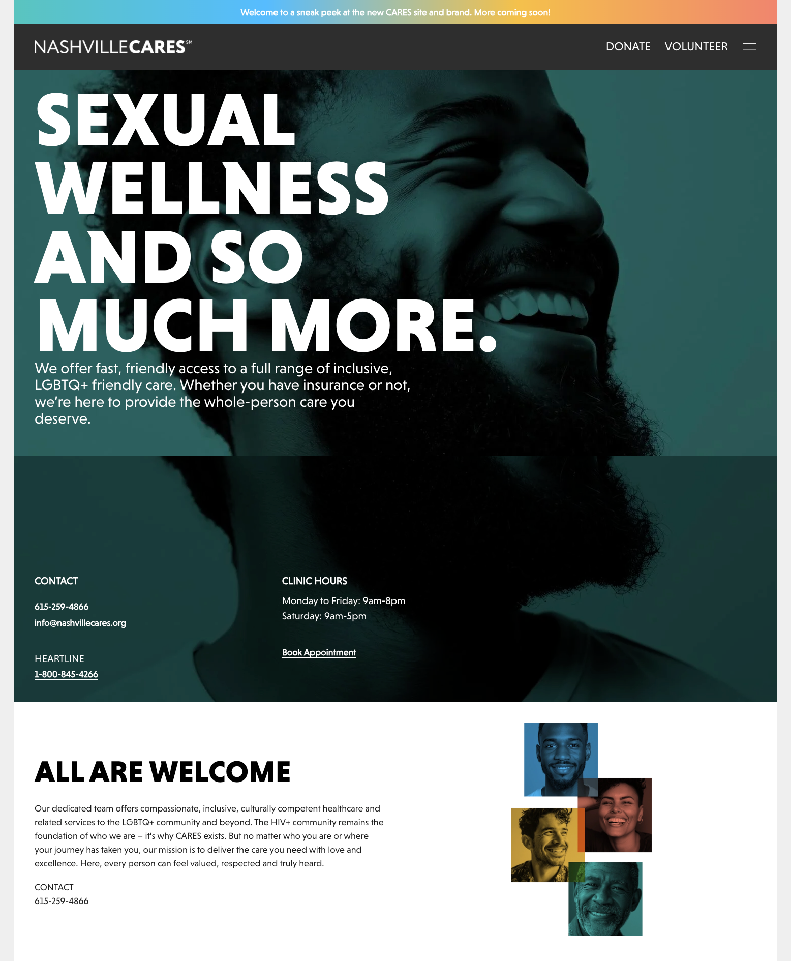
Digital Overhaul – Website redesign with mobile-first UX, easy navigation for clinic services, testing appointments, and donation flows.
Collateral & Campaign Toolkit – Consistent templates for outreach, fundraising, and social media storytelling.


THE OUTCOME
The rebrand positioned Nashville CARES as a modern, inclusive health leader, strengthening connections with both long-time supporters and new audiences.
Unified Brand Presence across clinic, mobile health units, and community programs.
Increased Engagement – early analytics show higher web traffic and improved appointment bookings post-launch.
Stronger Funding Narrative – clearer messaging for grants and donor appeals.
Community Pride – staff and clients report a renewed sense of mission and visibility.
“You didn’t just deliver, you transformed us. In only six weeks you accomplished what should have taken nine months, creating a stunning, heartfelt, and powerful new identity that feels exactly like us.”
— Director of Strategy & Development, Nashville CARES